case study 02.
TYPE specimen
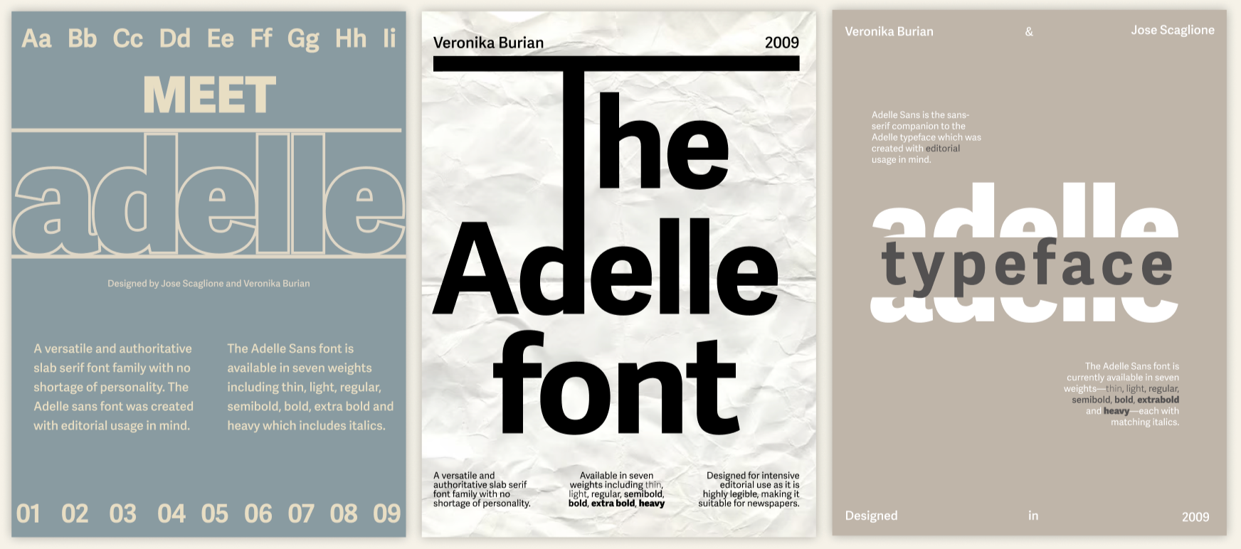
This was my first project from First Year and was the first time I was able to adapt what we were learning at the time onto an actual design. This Type Specimen was created to showcase the Adelle font and the impact it can make on branding.
Brief
Create a Type Specimen Poster for screen based on a font.
User & Audience
For brand and typographer designers who are wanting to visualise how a certain font will look for their design.
Process
Choosing my typeface
I chose to base my specimen off the Adelle font that was created by Veronika Burian; this is a slab serif typeface which was designed for editorial use in magazines and newspapers. I decided on this typeface because I prefer the sans fonts more than serifs; in my opinion, you can be more flexible with this type of font and make your design visually more professional.
I created a mood board of typeface specimens I saw on Pinterest and the one that struck out to me the most was Grotesk poster because I liked the idea on how they split the font in half to insert the word ‘typography’ in the middle.
Figma Process
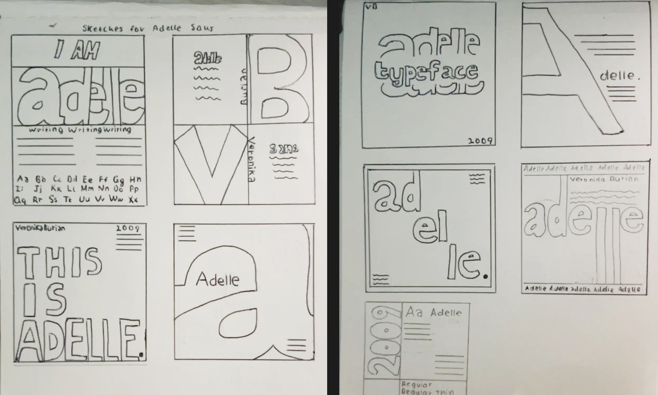
I chose three of my sketches and made them digitally through Figma. This was my first time using the website so I really enjoyed learning how to navigate through it. I merely focused on the layout rather than the colour so that I could get a quick glimpse on what one I wanted to build on. However, none of these struck out to me and felt something was missing. Although, after looking at the second design, it made me think that the elongation of the l looks like the letter ‘T’ which made me wonder, could I make that as a proper anchor for my entire design? I reverted back to sketching to experiment more with it.
Redesigning on Figma
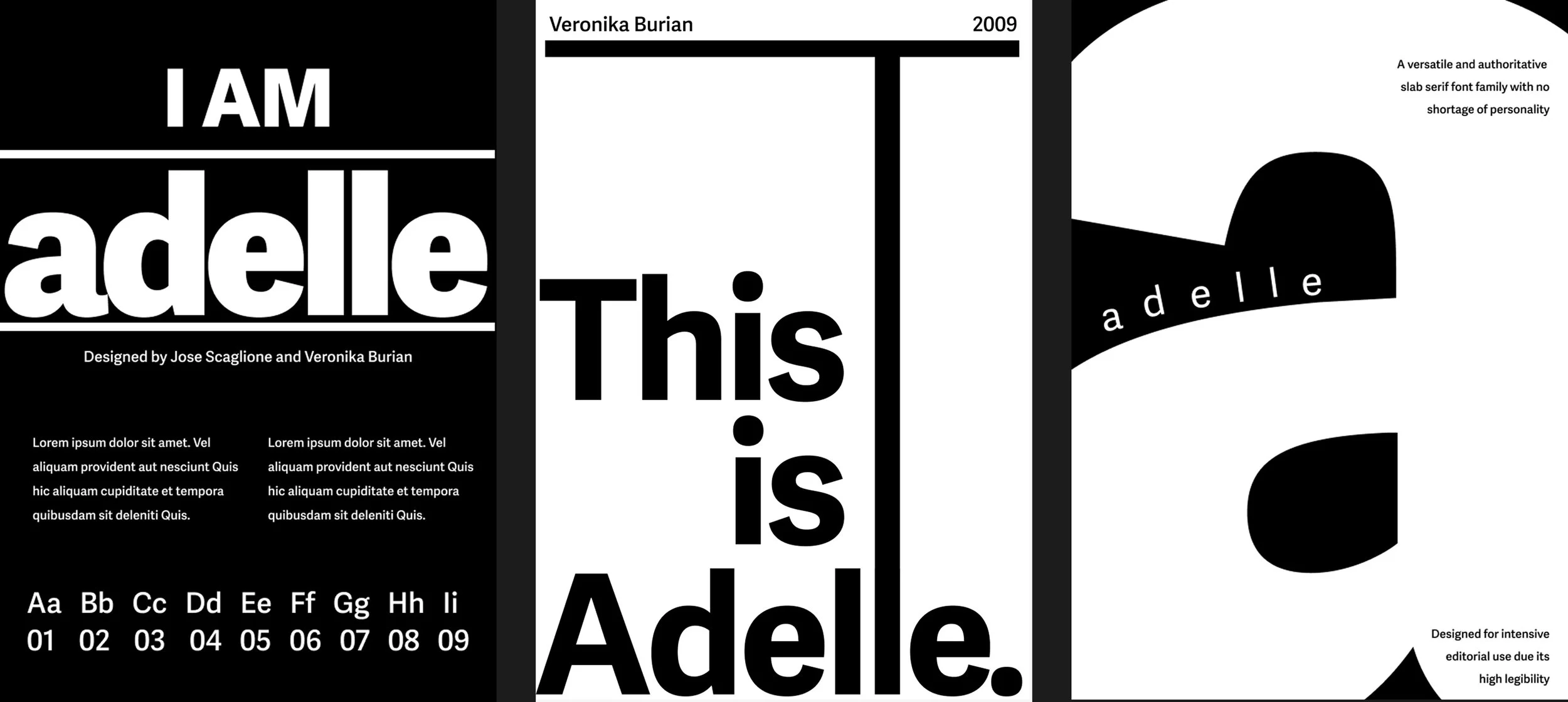
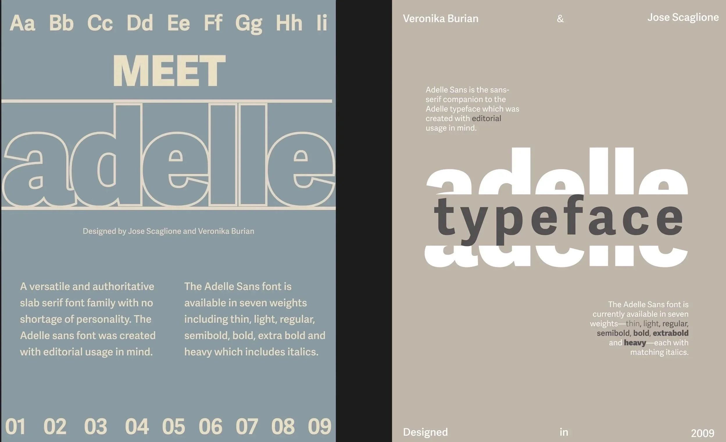
I began using colours in my specimens and wanted to attempt to make the splitting of the typeface sketch I had initially, but for the blue screen, I struggled in aligning the letters and numbers with each other which caused me to add more spaces between some of the characters, making it unbalanced. I preferred the right design more because whilst it was more of a simplistic design, it was more clean and my lecturer highlighted how I did the alignments of the small paragraphs well; however both these designs still didn’t stick out to me.
Sketching
I sketched as much layouts as I could to ensure that I was more confident when it came to using Figma; our lecturer emphasised to always start on paper and I found that as I continued sketching, the easier it became to think of new ideas.
Sketching
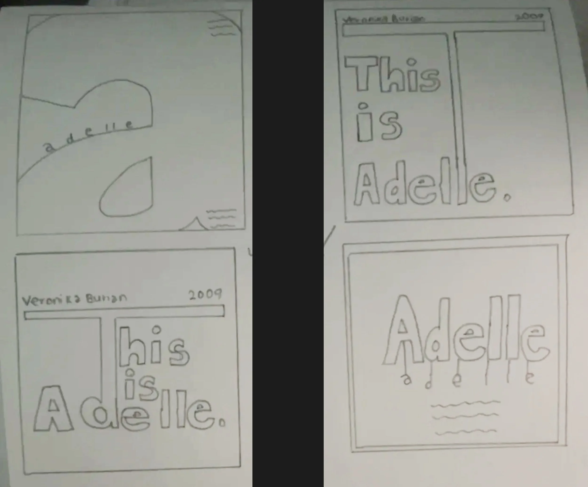
I decided to turn the letter ’T’ into a visual anchor by using it as a play on for the sentence ”This is Adelle.” By enlarging and emphasizing it, I felt that it allowed the typography itself to guide the layout rather than relying on separate graphic elements.
outcome
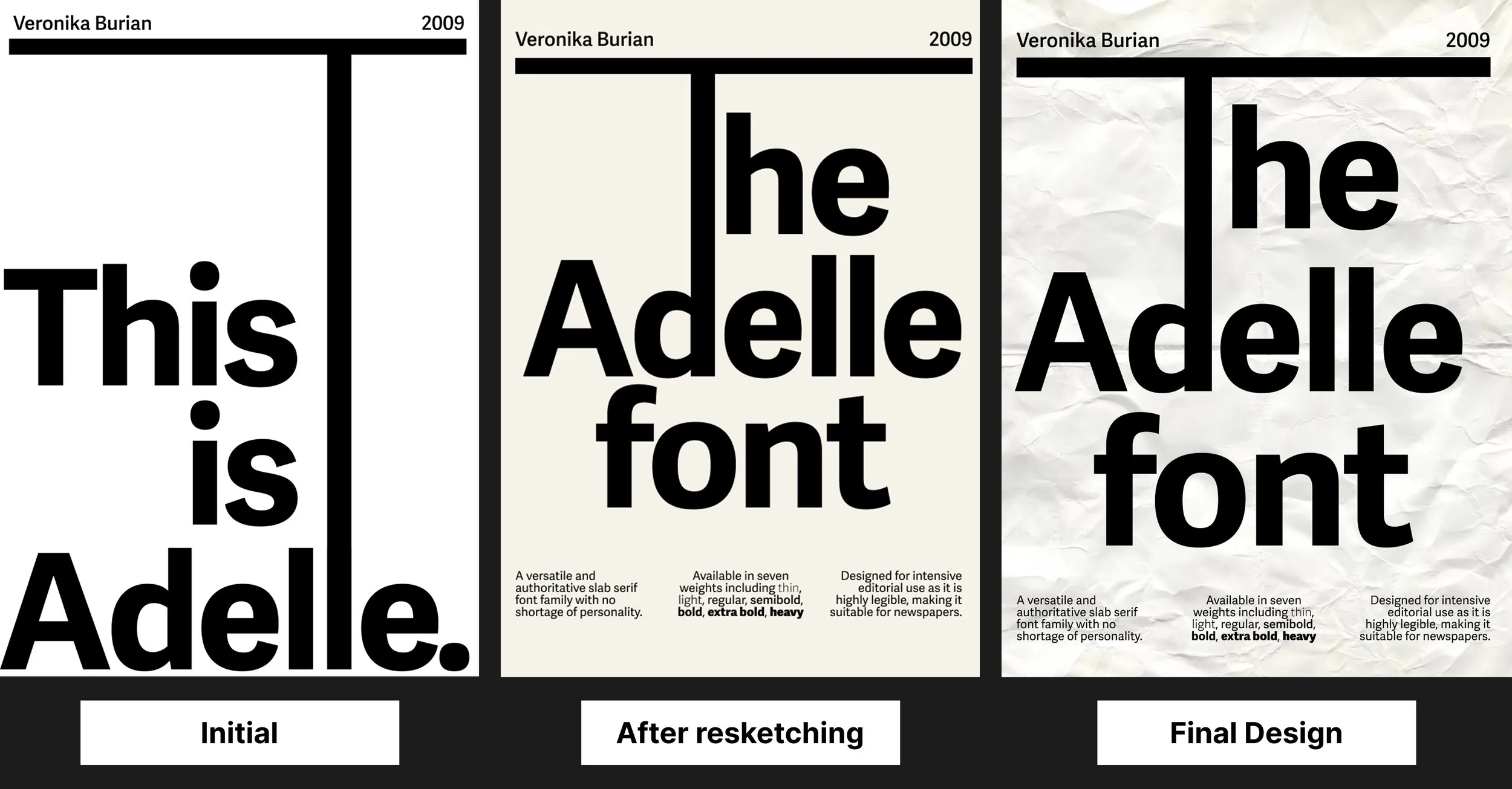
I decided to keep the colours minimal for the editorial look. Although to me, something still felt off and to emphasise how this typeface is “suitable for newspapers”, I applied a paper texture to give it that full effect. Whenever we had our class critique, I was able to clearly explain and justify my design decisions to my lecturer. By backing up my choices with references to the editorial concept specifically (paper texture), this process helped me gain confidence in the design and showed me the importance of being able to articulate why I made certain choices, not just how they look.